Color psychology plays a significant role in design, as it has the power to evoke emotions and influence human behavior. The careful selection and application of colors can greatly impact how we perceive and interact with various visual mediums, such as books or curated exhibitions. For instance, imagine walking into an art gallery where each room is bathed in vibrant hues of red and orange. This deliberate choice of warm colors creates an energetic atmosphere that stimulates excitement and passion within visitors.
Understanding the principles of color theory is crucial for designers aiming to create visually appealing and impactful experiences. By studying the relationships between different colors, their psychological associations, and cultural meanings, designers can effectively communicate messages through visual elements. Moreover, they can strategically use color combinations to elicit specific emotional responses from viewers. Whether it’s selecting complementary colors to achieve harmony or contrasting shades to create tension, mastering color theory allows designers to manipulate the viewer’s perception and enhance their overall experience with a particular piece of artwork or design object. In this article, we will delve deeper into the fascinating world of color psychology in design by exploring its applications in books, curates, and color theory itself.
The Influence of Color in Design
Imagine walking into a brightly colored room with vibrant shades of red, orange, and yellow. Instantly, you feel an energetic and stimulating sensation that uplifts your mood. This example illustrates the significant influence color has on design and our emotional responses to it.
Color psychology is the study of how colors affect human behavior and emotions. In design, understanding this relationship between color and emotion can greatly impact the overall effectiveness of a product or space. By strategically choosing specific colors, designers have the power to evoke desired feelings and create memorable experiences for users.
To delve deeper into this topic, let’s explore some key points about the influence of color in design:
- Colors elicit emotional responses: Different colors have been found to trigger distinct emotional reactions within individuals. For instance, warm hues like red are often associated with passion and excitement, while cool tones such as blue convey calmness and tranquility.
- Cultural influences play a role: The meaning assigned to certain colors can vary across cultures. For example, white symbolizes purity in Western cultures but represents mourning in Eastern cultures. It is crucial for designers to consider these cultural connotations when creating designs for diverse audiences.
- Color combinations matter: Combining multiple colors can amplify or mitigate their individual effects. Some harmonious combinations create a sense of balance and unity, while contrasting schemes can add visual interest or tension.
- Contextual factors contribute: The context in which colors are used also affects their impact on individuals’ perceptions and emotions. A bright red may be invigorating in a fitness studio setting but overwhelming in a hospital environment.
With its ability to provoke emotions and shape user experiences, color plays a vital role in effective design practices. By comprehending the psychological implications behind various hues and considering contextual factors, designers can harness the power of color to communicate messages effectively and engage their target audience more deeply
Understanding Color Psychology
The Influence of Color in Design: Understanding Color Psychology
Imagine walking into a room painted entirely in bright red. Instantly, your heart rate increases and you start to feel more energetic and passionate. This is just one example of how color can have a profound impact on our emotions and behaviors. In the world of design, understanding color psychology is crucial for creating visually appealing and impactful experiences.
To truly comprehend the influence of color in design, it is essential to delve into the realm of color psychology. Colors evoke specific emotional responses that can vary across individuals and cultures. By leveraging this knowledge, designers can strategically use colors to elicit desired reactions from their audience.
Here are some key aspects that contribute to the role of color psychology in design:
-
Emotional associations: Different colors are associated with distinct emotions. For instance:
- Red signifies energy, passion, and excitement.
- Blue evokes calmness, trustworthiness, and reliability.
- Yellow represents optimism, happiness, and friendliness.
- Green symbolizes growth, harmony, and nature.
-
Cultural influences: The interpretation of colors can be influenced by cultural factors. For example:
- In Western cultures, white often denotes purity or innocence.
- In many Asian countries, red symbolizes luck and prosperity.
- Purple has historically been associated with royalty in various societies.
-
Contextual considerations: The meaning attached to a particular color can also depend on its context within a design or branding scheme. Combining different hues or using contrasting shades can alter perceptions significantly.
-
Personal preferences: Individual preferences play a crucial role in determining how people respond to different colors. While there may be general trends regarding certain colors’ psychological effects, personal experiences shape these associations as well.
Understanding color psychology enables designers to create meaningful visual compositions that resonate with their target audience’s emotions and aspirations. By skillfully employing appropriate color schemes based on research-backed principles, designers can capture attention, elicit specific emotional reactions, and effectively communicate their intended message.
Transitioning into the subsequent section on “The Power of Color in Book Design,” we will explore how color psychology influences readers’ experiences and perceptions when it comes to books. From cover design to interior layouts, colors play a pivotal role in shaping our initial impressions and guiding our engagement with written content. Let’s delve deeper into this fascinating aspect of design.
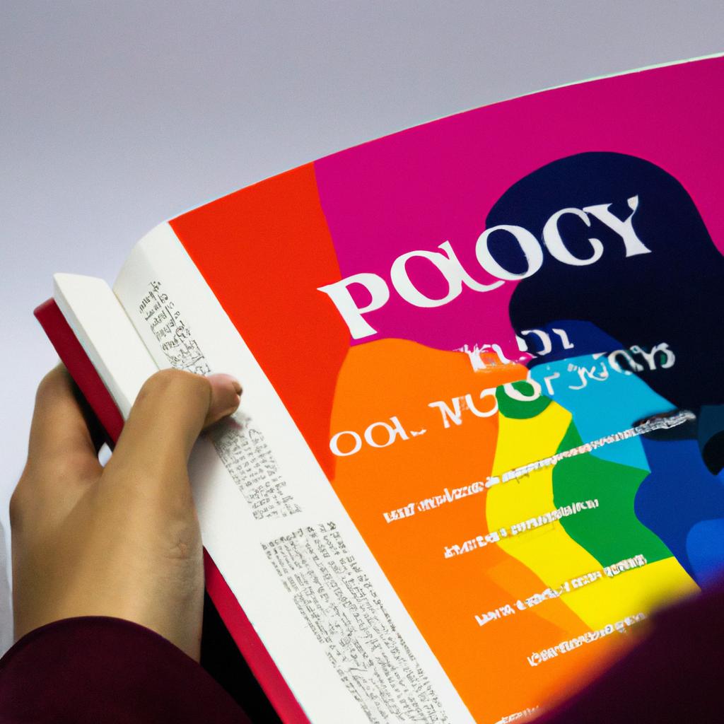
The Power of Color in Book Design
Color psychology plays a significant role in design, as it has the power to evoke emotions and influence human behavior. Understanding how different colors impact our perceptions can help designers create visually appealing and emotionally engaging experiences for their audience.
For instance, consider a hypothetical case study where a designer is tasked with creating a book cover for a thriller novel. By strategically selecting colors that align with the psychological responses commonly associated with thrill and suspense, the designer can enhance the overall reading experience for potential readers.
To illustrate the impact of color on emotions, here are four key ways in which specific colors can elicit distinct emotional responses:
- Red: This vibrant color often represents energy, passion, and excitement. It can evoke feelings of urgency or danger.
- Blue: Often associated with calmness and tranquility, blue conveys a sense of trustworthiness and reliability.
- Yellow: Symbolizing happiness and optimism, yellow creates a cheerful and inviting atmosphere.
- Green: Representing growth and nature, green fosters feelings of harmony and balance.
To further understand how color choices affect perception, let’s examine an example table showcasing various emotional responses elicited by different colors:
| Positive Emotion | Negative Emotion | |
|---|---|---|
| Red | Excitement | Anger |
| Blue | Tranquility | Sadness |
| Yellow | Happiness | Anxiety |
| Green | Harmony | Envy |
By leveraging this knowledge of color psychology in their design process, creatives have the ability to intentionally curate visual experiences that resonate strongly with viewers’ emotions. In the subsequent section about “Curating Colors for Emotional Impact,” we will explore practical steps designers can take to effectively utilize color theory in order to achieve desired emotional effects within their designs.
Curating Colors for Emotional Impact
In designing books, color plays a crucial role in capturing the attention of readers and evoking specific emotional responses. By carefully selecting and utilizing colors, designers can enhance the overall reading experience and convey messages more effectively. To illustrate this point, let’s consider a hypothetical case study: an author writing a children’s book about adventures in outer space.
When it comes to creating a visually appealing cover for this children’s book, the designer may choose vibrant hues such as bright blues and energetic yellows. These colors not only represent the vastness of the universe but also create a sense of excitement and wonder within young readers. By using contrasting colors, like bold reds or oranges against deep purples or blues for illustrations inside the book, different scenes can be emphasized to engage children emotionally throughout their journey with the characters.
To delve deeper into the impact of color on emotions, here is a bullet point list showcasing how certain colors can evoke specific feelings:
- Blue: Calmness, trustworthiness
- Red: Energy, passion
- Green: Harmony, growth
- Yellow: Happiness, optimism
Furthermore, incorporating color theory principles into book design enhances storytelling by establishing visual hierarchies. A three-column table below demonstrates how various color combinations influence emotional responses:
| Primary Color | Secondary Color | Emotional Response |
|---|---|---|
| Blue | White | Serenity |
| Orange | Brown | Warmth |
| Purple | Pink | Romance |
| Green | Gray | Stability |
By strategically pairing primary and secondary colors based on their psychological associations, designers have the power to guide readers’ interpretation of content and emphasize key themes or moods within each page spread.
With effective use of color in book design established as influential for evoking emotions and enhancing readability, the subsequent section will explore practical techniques for using color to evoke desired responses in readers. By understanding the impact of color, designers can create more engaging and immersive experiences for their audience.
Using Color to Evoke Desired Responses
The use of color in design plays a crucial role in evoking emotional responses from viewers. By carefully curating colors, designers can create an immersive experience that resonates with their audience on a subconscious level. To better understand how color choices impact emotions, let’s examine a hypothetical case study involving a book cover design.
Imagine a designer tasked with creating the cover for a thrilling mystery novel. They decide to use shades of dark blue and black to elicit feelings of suspense and intrigue. This deliberate choice taps into the psychological associations commonly linked to these colors, such as mystery, sophistication, and anticipation. By utilizing this color palette effectively, the designer aims to captivate potential readers even before they delve into the story itself.
To further illustrate the connection between color and emotions, consider the following bullet points:
- Warm colors like reds and oranges are often associated with energy, passion, and excitement.
- Cool colors like blues and greens tend to evoke calmness, tranquility, and relaxation.
- Bright colors such as yellows and pinks can convey happiness, optimism, and vibrancy.
- Neutral colors like grays and browns usually symbolize stability, simplicity, or elegance.
These generalizations provide a starting point for understanding how different hues influence our emotional responses within various contexts.
| Color | Emotional Response | Context |
|---|---|---|
| Red | Passionate | Romantic settings |
| Blue | Calming | Spa environments |
| Yellow | Energetic | Children’s play areas |
| Green | Refreshing | Natural landscapes |
Analyzing both broad categories and specific instances helps us recognize patterns in how color psychology impacts design outcomes.
As we have seen through our examination of color psychology thus far, designers can strategically utilize different hues to evoke specific emotional responses.
[Transition] With a solid understanding of how colors influence emotions, we can now delve into practical applications of color psychology in design.
Practical Applications of Color Psychology
Building upon our understanding of how color can evoke specific responses, we now turn our attention to the practical applications of color psychology. By harnessing the power of color in design, it becomes possible to create visually compelling experiences that engage and influence individuals.
To illustrate the real-world impact of color psychology in design, consider a hypothetical case study involving an e-commerce website specializing in athletic footwear. The design team behind this website utilizes various colors strategically to elicit desired responses from visitors. For instance, they employ shades of blue and green throughout their interface to convey a sense of trustworthiness and reliability. Additionally, they incorporate vibrant red accents on call-to-action buttons to instill a feeling of urgency and encourage conversions.
- Warm colors such as red, orange, and yellow are often associated with feelings of energy, excitement, and passion.
- Cool colors like blue, green, and purple tend to evoke calmness, serenity, and trust.
- Neutral tones such as gray or beige can create a sense of balance and sophistication.
- Bright hues like pink or neon green may provoke feelings of playfulness or creativity.
Table showcasing emotions evoked by different colors:
| Color | Emotion |
|---|---|
| Red | Energy |
| Blue | Trust |
| Yellow | Happiness |
| Green | Calm |
By thoughtfully applying these principles across various mediums – be it web design, interior decor or branding strategies – businesses can effectively connect with target audiences on an emotional level. Through careful selection and implementation of appropriate colors within their designs, organizations have the potential to enhance brand recognition while also influencing customer perceptions and behavior.
Incorporating color psychology into design is an ongoing process that requires continuous evaluation, adaptation, and experimentation. Designers must remain attuned to evolving trends and cultural nuances to ensure their color choices align with the intended emotional responses. By doing so, they can create immersive experiences that resonate deeply with individuals, leaving a lasting impression far beyond aesthetics alone.
Remember: effective application of color psychology in design demands meticulous research, testing, and an understanding of how various colors impact human emotions. With this insight as our guide, we embark on a journey to explore the intricate interplay between color theory and visual communication in the world of design.
Comments are closed.